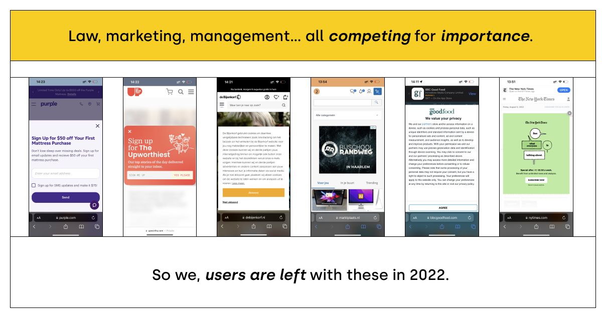
While the goals and users' tolerance towards this intrusive messiness may have changed, most websites continue to ignore the delicate balance between driving us insane and nudging us towards their goal.
With the help of UX design concepts, we attempt to guide those concerned with their users' digital well-being and, more broadly, their bottom line.
The anatomy of attention seeker UI elements
When we categorize our attention-seeking options, we can measure the "intrusiveness" of a solution on the attention and interaction axes.
Attention refers to how much cognitive load is imposed on our brain, whereas interaction refers to whether or not the website/app's content is accessible.
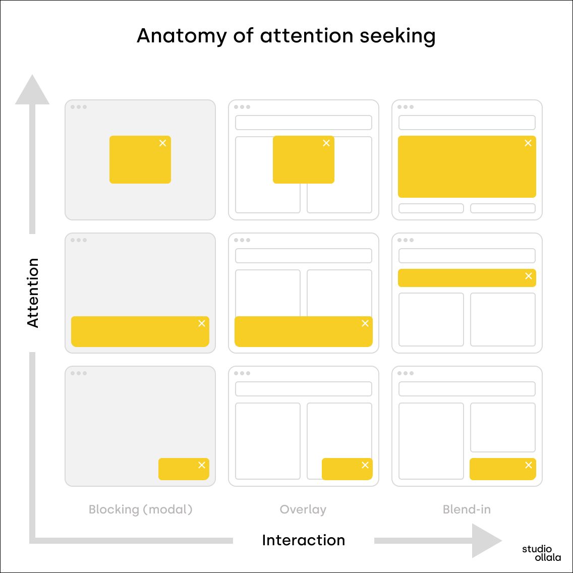
Let's see what our options are purely from a user interface design perspective.
Modals
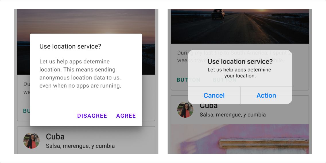
A modal "pops up" on the parent screen and disables its content, so you can't interact with the main application or website until you give some input. These are the most disturbing UI elements since they prevent you from doing anything. They are essential in our UX design toolbox, but improper use might wreak havoc on usability.
Examples of modals - in the context of web applications - are paywalls or cookie consent walls. And in my opinion, those two cases should exhaust all the reasons you should have a modal.
If you ever need to design a modal, here are some tips to ensure you don't violate UX laws and ruin the usability of your website or web app.
Popups
Popups are very similar to modals, except they don't block interaction, only overlay the screen. Although, the usability is highly reduced because large areas become inaccessible.
Sheets
The UI elements that fly in from any side of the viewport are called sheets. The most common are the bottom and the right sheets, but top or left sheets also exist. Their function is to provide supplementary content or actions for the current view.
Sheets can have a normal and modal form as well based on whether we can interact with the rest of the view or not.
Banners
Banners provide space for prominent messages and allow the users to give input when necessary. They are the most subtle attention seekers, blocking only a small area and visually less obstructive.
I think a banner would suffice in most cases instead of an annoying modal for that promo code or newsletter signup form. Marketers would argue with A/B test results and conversion numbers but can't we find the middle ground here? You might get more subscribers, but how do you know your business won't do better overall with a better user experience? I think it would.
The danger lies in the details.
Overusing attention seekers imposes another negative effect: we'll become clicking zombies without actually caring what we're doing.
This term first occurred when Windows introduced its more sand-grained privacy settings. After a few clicks, we learned that hitting that "Allow" button would give us access to whatever we wanted to achieve.
It is dangerous because, in most cases, we'll fall back on this motoric reaction even when we should have paid attention.
The same applies to cookie consent. Do I actually care when the 26th site asks for permission? I don't.
The Law of Prägnanz
There's a phenomenon in UX design called The Law of Prägnanz. It says we'll interpret ambiguous or complex images in the simplest form possible.
In our attention-seeker context, that means we'll mindlessly search for the lowest hanging fruit: first a close control, then - in the absence of an easy escape - the most colorful "Ok," "Allow," etc.. buttons.
And that is problematic because the users might miss on actually important things, or they'd close your promo poup even before realizing that they could have gotten a whopping 50% off of their order - not to mention the case of the human centipede episode from South Park.
How to design attention seekers the right way?
It doesn't matter whether you design a modal for legal reasons or a popup for your promotion; you can't ignore the fundamental laws of UX design. Doing that will result in long-term setbacks despite the tempting short-term wins.
The best way, of course, is always to question whether we need a modal or not and be frugal with space on our website or app.
But if we decide to go for it, here are some closing thoughts on how websites or web applications can design better experiences.
Have a way to dismiss or escape
A close button in the top right corner is the best way. But if - for legal reasons - user input is unavoidable, provide a primary and secondary action in the bottom right part of the popup.
The most common mistake I see is that these buttons are not in the viewport and require scrolling which is very disorienting.
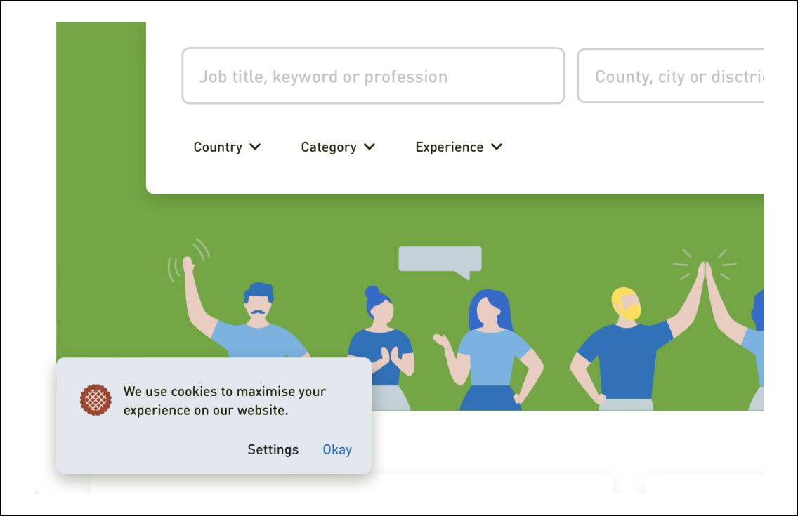
Do we need modals for cookies?
In the EU, we have to deal with the GDPR that requires user consent before placing any cookies or initiating tracking activity. Some sites prevent us from interacting entirely simply because of overcautiousness - or because their business model is built on user tracking. In most cases, a modal is unnecessary and exists only to trick users into submission using gray UX patterns - and thus should also be included in GDPR, in my opinion.
Give some visual hints
Don't block what's behind the modal. Make it somewhat transparent so users can at least approximate whether they are at the right place and have a chance to decide whether what they were looking for is behind the modal before taking action.
Pay attention to the technical details
There's much more to UI elements than their content or appearance. Whether they're implemented in code the right way is equally important. Developers must properly set up focus management, semantics, and accessibility; otherwise, even regular users can get disoriented - not to mention our fellow users with disabilities. Modern front-end frameworks usually take care of that, but you might want to read Scott O'Hara's article from Smashingmagazine.