Most of us interested in the startup world has already seen a chart explaining why most tech startups fail.
“Nine out of ten startups fail in the EU.“
Or, the most common reason behind startup failures:
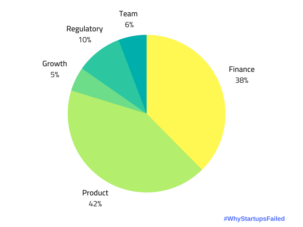
I am a digital product designer, not a finance expert or a business consultant, so I am particularly interested in that 42% - marked as “product-related” factors. As you can see, this is the most significant slice. So my theory is that if startuppers could get better in that part, it would significantly improve their chances. So let’s explore this theory further.
Sadly, looking at such charts - and reading the articles they usually come with - does not prove helpful. Mainly because these articles fail to uncover deeper insights behind those numbers. Or, for that matter, provide some guidance on how to fix that; e.g., what should new startup founders do to avoid failure because of product issues?
I’ve been more involved with startups over the past six years, and I have worked on and with several of their digital products. I saw a couple of hiccups from clients and even more from those who finally didn’t become one. So what does that 42% mean? What are those so-called “product failures?”
I like to turn to UX design tools to get to the bottom of things. They help me better understand and evaluate specific situations. One of my favorites, for example, is the five why’s (or the 5 WHY-s) method. It’s as easy as it sounds: instead of accepting something as it is - in this case, 90% of startups fail - we peel back more and more layers from our problem onion by asking a single question: why?
Here’s the five why’s evaluation of our problem statement:
Problem statement: nine out of ten startups fail
Why do they fail? For various reasons, but most likely due to an inferior product.
Why is their product inferior? Because they don’t match people’s needs.
Why can’t they match people’s needs? Because they didn’t spend enough time figuring out what people needed.
Why didn’t they spend more time figuring out what people needed? Because they were too focused on building their idea.
Why were they focused on building their idea? Most likely because of confirmation bias.
(“Confirmation bias is the tendency to search for, interpret, favor, and recall information in a way that confirms or supports one’s prior beliefs or values.” Wikipedia .)
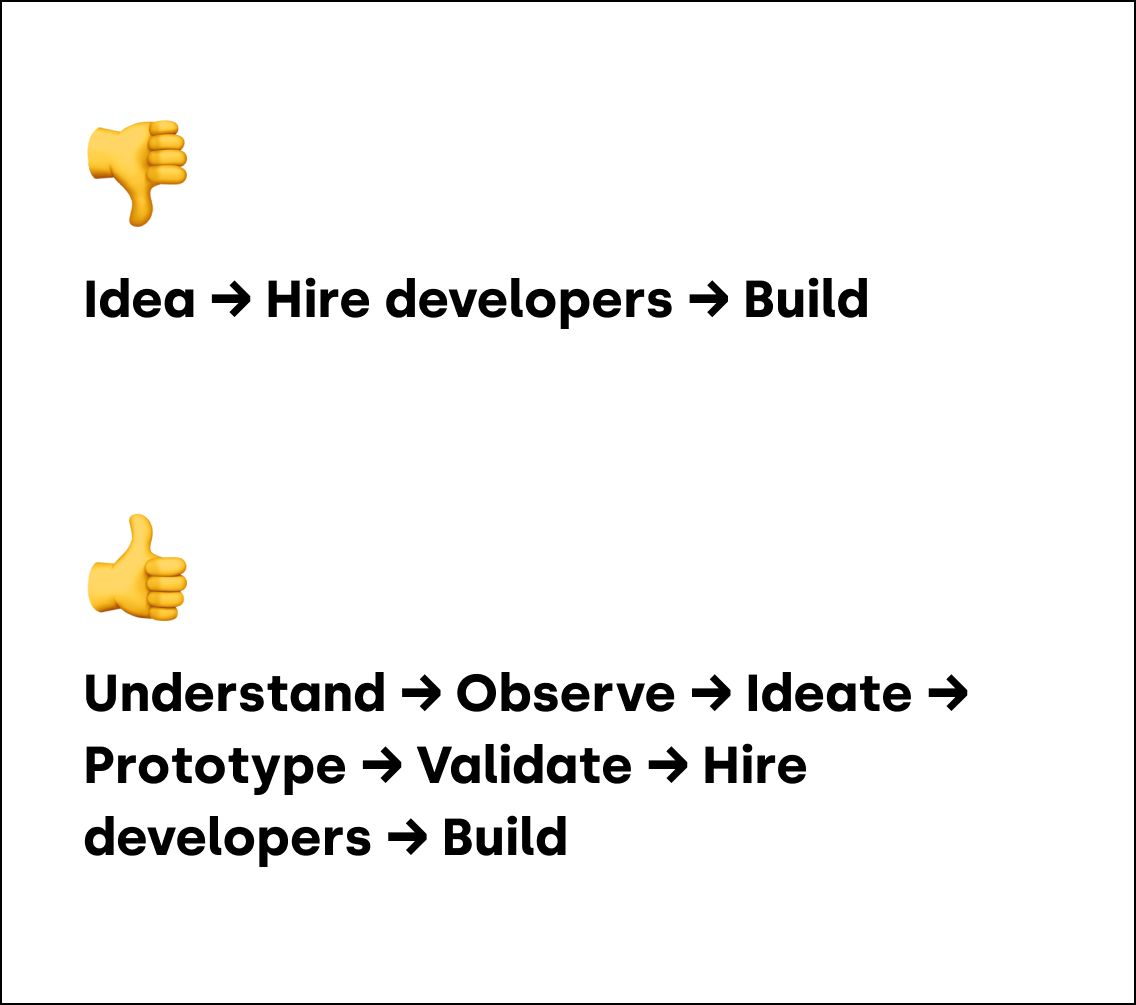
The most common reason behind product-related failures is that the team started building too early. In most cases, real-world users don’t even see a project before beta or alpha tests. To me, that is a warning sign. Before gathering feedback, it is impossible to know whether an idea is feasible - but they’ve already made a considerable effort to deliver something.
Startups are too busy with the how before the what.
All is that because confirmation bias clouds judgment. Confidence that the product in itself should be successful nurtures useless discussions about whether they should build with React and Tailwind instead of asking questions like: “is this idea genuinely useful for our target users?” or “does the current user interface convey the intended value?”
The thing is, the technology you build with doesn’t matter. As you grow, you’ll have to refactor the whole codebase anyway. It is more vital that you build the right thing, that your user flows make sense, that your user interface is easily understandable, or that your onboarding provides a glimpse of the value you deliver. And that is product design.
...the technology you build with doesn’t matter. As you grow, you’ll have to refactor the whole thing anyway.
Cutting-edge technologies don’t build successful products; people do. You need to understand users and have systems in place to make them. That’s product design and product thinking.
Product design is the foundation, not the next step
In my experience, early-stage product teams see product design as a luxury, something they can afford if they grow big enough. But that’s wrong. This thinking confuses design with expensive pixel-pushing and “award-winning” eye candies. But in reality, design is the link between the users and the product. Design is not only about how it looks but how it works. And that’s a confusion I see too often.
A natural next step when you gain some traction might be a rebranding or improving your design system. But that’s only the cherry on top. The base should already have been designed with a product-led mindset.
Signs that you started building too early
Your app is a ghost town
So you’ve built this exciting new app. Your “growth-hacking” worked on me; I’m all up for it. I signed up, and I was immediately disappointed. I’m presented with either a completely empty view or irrelevant content that is useless to me.
You can circumvent this with a good onboarding flow where you gather valuable info by telling users to customize their experience and tailor their first impression according to those preferences.
This is what, for example, Spotify does when you sign up. Before seeing any music, you’ll have to follow a couple of artists and find some friends to connect with. This approach ensures that the music recommendation you first see won’t be Jay-Z when you’re into Chopin.
Good onboarding can also help overcome the classic chicken-egg situation, which is also very common.
To design a fluid onboarding experience, you must understand and tap into how your users perceive value. Otherwise, they’ll think your product does not fulfill their needs.
Fractured experience
The other phenomenon I see often is when you have to navigate across multiple - usually painfully slowly loading - views to unlock the value an app provides.
Imagine, for example, a SaaS product that helps marketers with campaign reporting. To create your first report, you’ll have to connect your data source somehow. Now you have to figure out how developers pieced together all the functionalities by muddling through arbitrarily named menu items.
Had they understood your goal, this could have been a multi-step user flow that starts with a clear “New report” CTA and walks you through all the necessary actions that you need to take before seeing a report in one flow.
How to avoid that
My best piece of advice: involve a product designer from the beginning. Master the value proposition, validate it, then start looking for developers who can realize it. A CTO can wait until your team complains about how inconsistent coding style holds them back. Then - if you have enough cash - you can hire a CTO. Maybe.
The objection I often hear about this design thinking approach is that “this is too slow; I want to move faster.” I always answer with a question: do you want to lose your money faster?