Some time ago, on a warm Friday afternoon, I decided I deserved a little treat after a day packed with client meetings. Right at that moment, a memory of the smell and taste of freshly baked Italian dough, tomato, and cheese hit my nose. I knew what that treat was going to be: pizza!
I immediately opened a new browser window and started looking at pizza menus of nearby restaurants. If you ever tried to order pizza, you might have grumbled about the oversupply of choices on their menus. I don't think I'm the only one who hesitates whether I should have prosciutto with tomato or with olives. Why do most places want us to crawl through 30+ pizzas?
Some might feel better with more choices; I don't argue. But business-wise, it's counterproductive; I'll explain why.
There's no doubt though if you look at the most successful, most popular places, they all have a limited menu. The place I finally ordered from had five kinds of pizzas. The same is true for digital products: the ones that do few things well always end up more successful.
Now, since I'm a UX designer and not a HORECA professional, I can't tell you more about restaurant economics. However, I hope this article gives you a new perspective on the concept of simplicity and how you can use it to build better user experiences in digital products.
What is simplicity?
Even the UX gurus Don Norman and Jakob Nielsen's definition of UX design includes simplicity as an essential part of a good user experience. But what is it exactly, though?
After some googling, the most common definition refers to simplicity as something inverse to complexity.
Like this one:
the quality or state of being simple or plain and not complicated or difficult.
Source Merriam-Webster
But opening the dictionary presents us with the following:
the quality or condition of being easy to understand or do.
And personally, I love this one because it doesn't define simplicity as the opposite of complexity.
Is simplicity the opposite of complexity?
As a good UX designer would answer: yes and no. It depends.
Philosophically it might be. But honestly, I don't know. I'm not the right person to make that argument.
However, in a UX context, I think the opposite of simplicity is confusion.
Our world is inherently complex and complicated. Users want to use (digital) products and tools that help navigate this world where everything is intertwined with something else.
If you'd ask me if I prefer a banking app where I can only make money transfers (simple) over a universal banking app where I can also manage my investments (complex), I'd go for the latter.
Does it mean a banking app can't be simple?
You might have come across this - almost - common-sense quote.
Perfection is achieved not when there is nothing more to add but when there is nothing left to take away.
It's credited to Antoine de Saint-Exupery, but I'm always suspicious about the authenticity of such quotes.
And I understand why so many people like this quote. In many ways, I do as well. But as always, it's not black and white.
So what is it then?
The opposite of simplicity is confusion.
We have arrived at Tesler's Law, one of the existing UX laws.
It says:
...for any system, there is a certain amount of complexity that cannot be reduced.
So does it mean we can't design simple user experiences for such systems and applications? Does it mean our grandparents must familiarize themselves with fintech terminology if they want to keep their bank accounts? Not at all.
Let's go back to the original notion of simplicity: being easy to understand or do. Complex systems can't be simple, but they can - and should be - simple to use. As designers, it is our responsibility to design easy-to-understand products. Design has the ability to transform complex ideas into simple solutions.
The problem with the abundance of choices
Back to pizzas.
Earlier I ranted about how I hate choosing from 30 pizzas. Moreover, science has already proved that as the number of choices increases, it is less likely we can make a decision - more about that later.
But in reality, It's not the mere number of overall choices that causes friction. It is how they are presented; usually without any grouping or order.
Imagine this: you've spent a day walking around the curly streets of a medieval town in Italy. You're tired, it's way too hot, and the kids are starving. Now choose something from this list:

What seemed to be a good idea on paper (give as many choices as possible) became contra-productive and backfired (it takes too much time to decide).
This brings us to the next UX design law: Hick's Law.
Hick's law says:
"...increasing the number of choices will increase the decision time logarithmically."
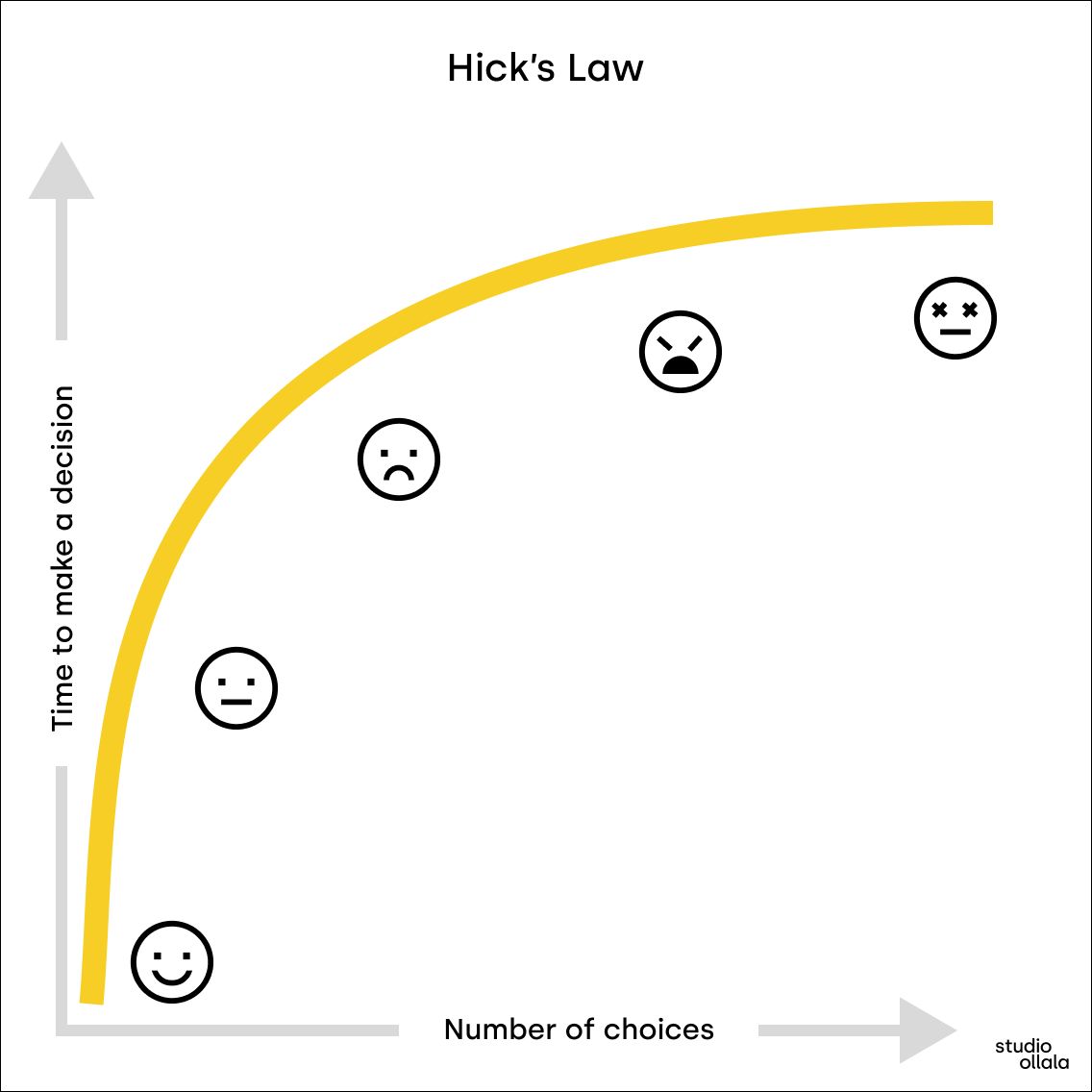
In plain English:
- put more choices on the menu, and people will have difficulty choosing
- add more features to your product, and people will suffer using it
But I just mentioned that our world is messy and complex, and so is your app, webshop, or website because it needs to support various types of users. What can you do to reduce the friction of choice bloat?
How to tame complexity into simplicity?
Luckily, there's a solution. In fact, a series of actions that you can do to prevent your product become complicated or confusing.
1) Introduce hierarchy
Going back to the pizza example, if you want to sell 500 types of pizzas, because heck, that's your thing, you should at least categorize them!
Could you decide faster if the menu of 500 pizzas - mentioned above - would have been presented in a well-categorized format?
- Meat
- Salami
- Ham
- Bolognese
- Vegetables
- Seafood
- etc... I would.
Look at, for example, IKEA's home page. They sell thousands of types of products, yet it isn't overwhelming at all. They put the effort in, did their homework, and researched that users like to browse by room or prefer categories if they know what they want. Complex made simple.
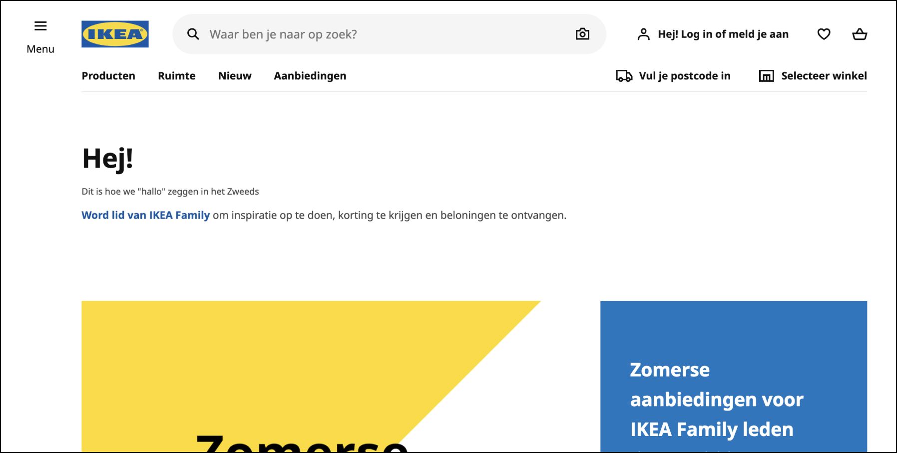
Now, I think we can all agree that IKEA is a very successful retailer. Probably more successful than Sklum - I've heard about first while researching webshops for this article.
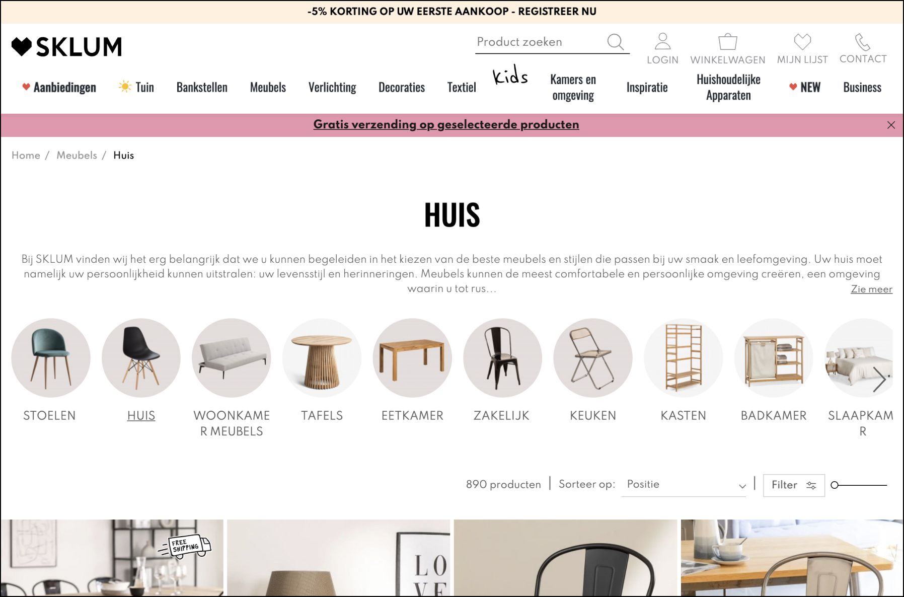
Comparing the two stands out: IKEA removed every unnecessary choice and made it simple to navigate their massive stock. Also, notice the enormous search field, which is the primary action they want to draw your attention to.
Is IKEA's business simpler than Sklum's? Not at all. Yet they managed to convert their complexity into a pleasant user experience.
2) Lead users toward the right features
When dealing with a complex product, you don't need to give up on simplicity.
I like, for example, how Jira's mobile app made it easily accessible the issue list. I know Jira is bloated, but with the iPhone app, they managed to pull off something usable; it does exactly and only what I need - the 4.5-stars rating confirms that.
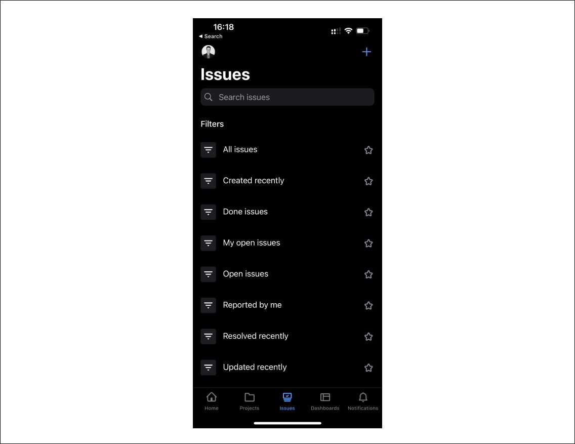
They could have just let users configure some universal filters, but they understood that might be more complicated, especially on the go - which is the point why Jira's mobile app exists.
So they decided to take a side, did their research, and provided us with pre-defined filter options - for which I'm very grateful. Again, complex made simple.
3) Evaluate your decisions and say no
Do not feel liberated by the above-mentioned Tesler's law: "...for any system, there is a certain amount of complexity which cannot be reduced."
It doesn't mean you can lean back, bloat your product, and shout, "but it's complex."
I like to use the impact-effort matrix with my clients to evaluate feature decisions. It helps understand the potential value a particular feature might introduce into an app and weeds out the nice-to-have ideas.
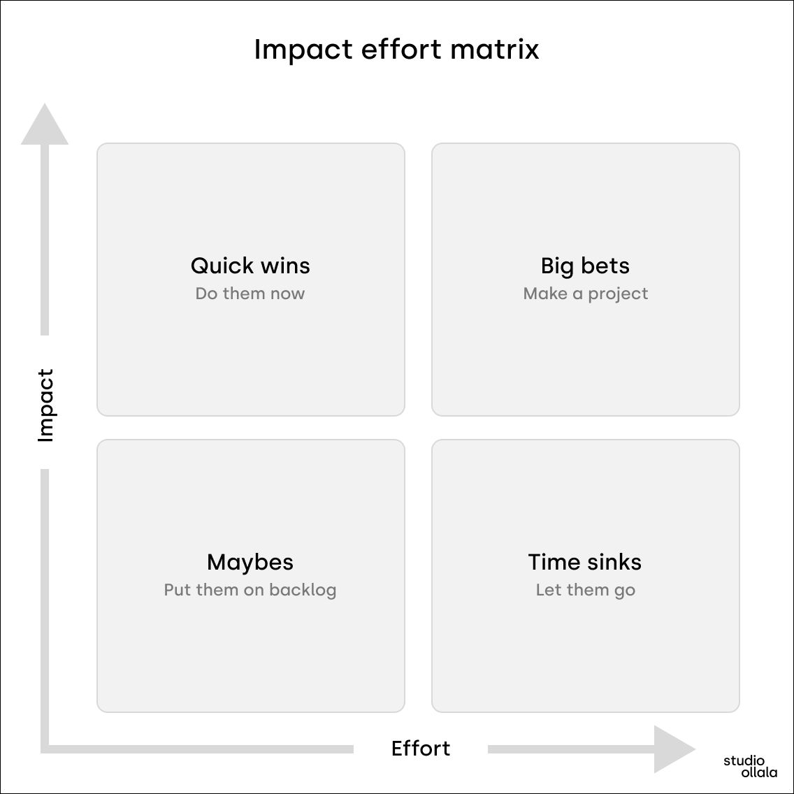
It maps features against two dimensions: how much effort it'd take to deliver it and how much value (e.g., revenue, conversions, etc.) it'd bring.
You want to focus on things that generate the most value with the least effort, and ditch those wasting your time.
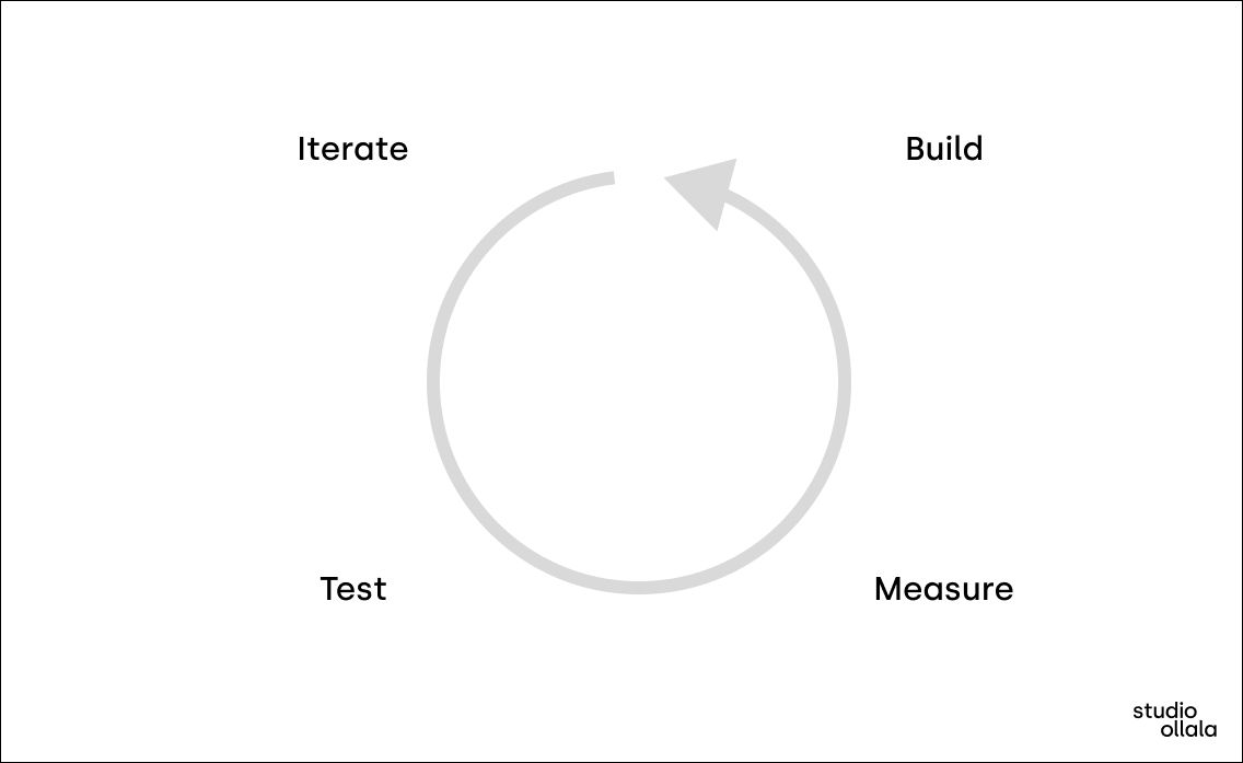
4) Establish the Iterate-test-build-measure cycle
Not a single human is capable of predicting the future when it comes to user behavior. People make assumptions - "I think users might like this feature."
But there's a saying: AssUMe stands for making an Ass out of U and Me. And I agree with that. We have to measure whether our assumptions are valid or not before adding new features or changing old ones.
Make a low-fidelity prototype, sit down with 4-5 users to talk about them, and you'll see whether you need that extra five things or not - usually, you don't.
Simplicity is scary
It always means that you need to take a side, leaving you with the feeling that someone might hate your solution - and some will. So you'll face friction with developers and stakeholders who think software should be agnostic and general purpose.
That is wrong. The best products, digital or not, have vision. They're very particular about who they want to help and how. Learn from them and put your fears aside.
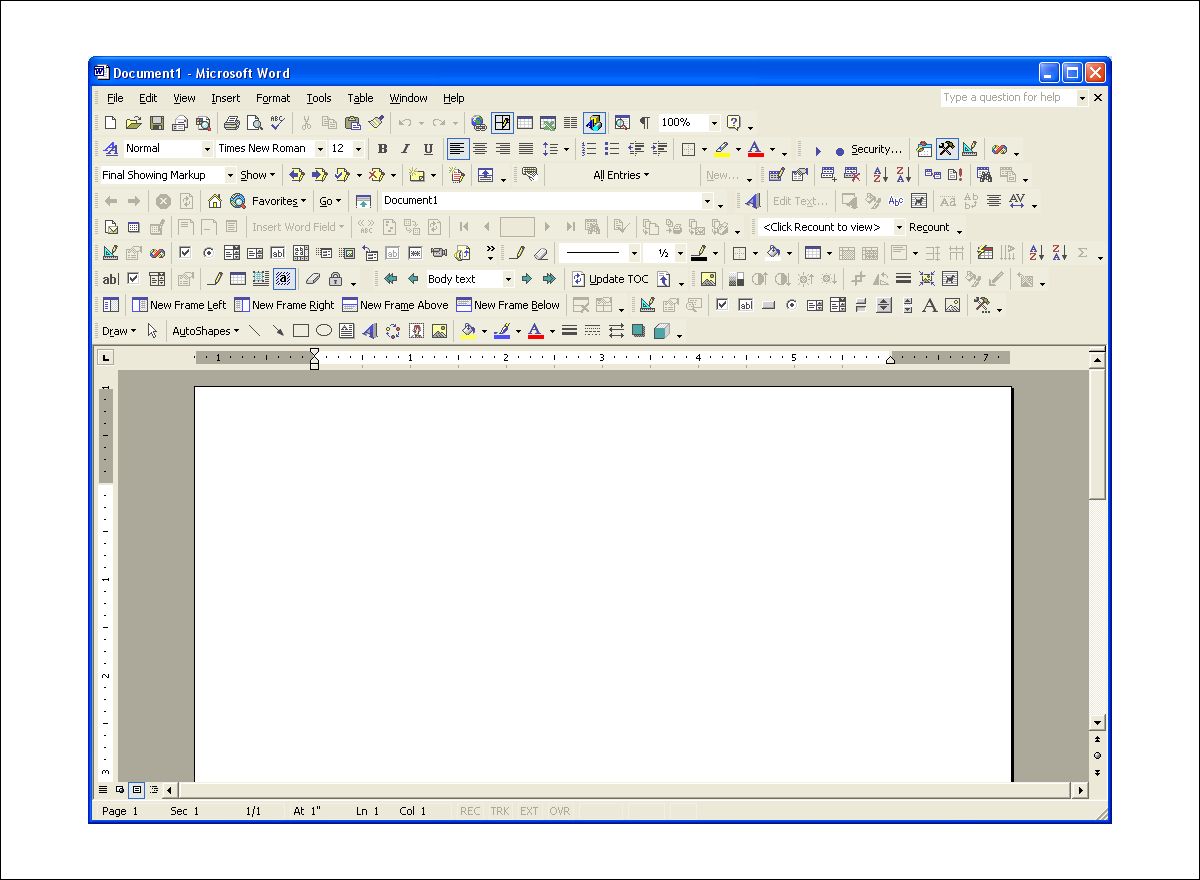
Compared to Microsoft Word 2000, Google Docs says content editing should be easy. They took a side and said no to feature bloat.
Takeaway
When it comes to feature decisions, managers tend to freak out because usually, they don't have sufficient information - or authority - to make that decision. This fear leads to complexity in digital products and leaves us users confused.
Based on the assumption that an abundance of choices will bring more business, our products end up overloaded with features and information we don't need. Hick's law proves this assumption wrong.
Simplicity does not oppose complexity. Complexity is not the enemy; confusion is.
To make a digital product simple, you should not necessarily force reducing complexity but rather manage it by clever design decisions.