I used to design many internal applications for big companies in the past, and that is where you'd expect Excel to be the go-to choice. However, lately, I often stumble upon regular consumers using excel to enhance or supplement the usage of digital services - think of shopping or finances.
About a week ago, I wrote about simplicity and specifically mentioned Office products being a usability nightmare in that area. On the other hand, I've also said that -general- users prefer general tools that help solve complex problems over specialized tools designed to do one task.
So this is the perfect time to explore from a UX designer's perspective: What makes a tool so good that we use it for everything, even if it's not the right one? Or even better: how can a digital product be so successful while being cursed among usability professionals?
Principles of UX design
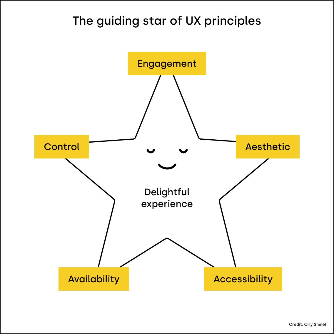
Let's see what checklist any piece of software needs to complete to appeal to users. There are too many classifications of these principles ranging from 3 to 16; I'll settle with these five, inspired by Oryl Sehleff's star model.

If you're interested, you can read more about each principle via this link; right now, let's focus on how excel masters these.
Let's face it: spreadsheet applications are like a no-code app builder. We can achieve a lot using them, and they satisfy most of these principles quite well. If you have a SaaS product and find your direct substitution is a spreadsheet, you're doomed - unless you provide substantially more value on either branch of the guiding star.
There's a designer in everyone - the aesthetics
Let's zoom out from the cluttered menu bars and the apparent feature bloat of the Office products - mainly because we also have Google Sheets with a much cleaner and leaner interface.
The reason why excel is so appealing to everyone is that users can create and frame their own solutions however they like.
Too many times, I've heard design workshop participants saying, "Ohh, I'm not a creative person." Only to discover how exceptionally designed sheets they've created with colors, charts, and explanatory blocks. Most digital products ignore customization, stating you can never appeal to everyone; others try to distinguish themselves by embracing it.
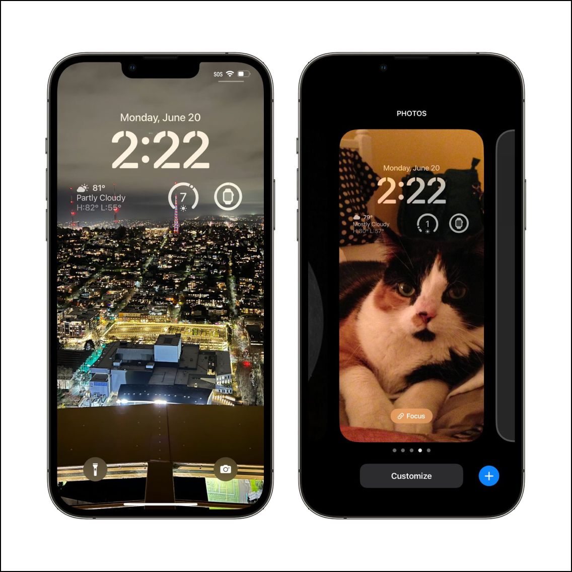
With iOS 16, for example, many new features will arrive that allow us to customize our phones to an extent unimaginable before.

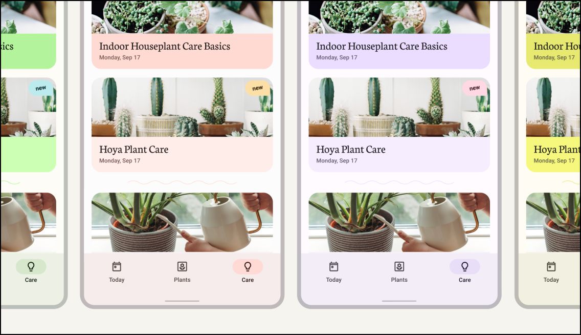
Google -and Android- did the same not too long ago by introducing the new Material Design.

But there's more to it than customization why we insist on our own spreadsheet monsters creatures.
The silver bullet of a delightful UX is involvement - engagement and control Fact: we like to break down problems and design our own solutions. I found this to be the primary source of friction when transitioning from spreadsheets to ERP systems in companies: they're fixed, limited, and can never satisfy the differences in how people process information.
The main reason we love excel is the level of engagement we feel when creating our own mini-applications and the control -just the right amount- we get. It's similar to when we're allowed to stuff anything into our cubicle; we feel more at home. Our spreadsheets are like a piece of our personality; we're proud of and protect them fiercely.
Familiarity beats brilliancy - availability and accessibility
Designers often fall for the temptation of inventing the wheel. Sometimes expressing their importance with "clever" and unnecessarily complicated designs - I was no exception.
During usability interviews, we often find that users must rely on their notes or own spreadsheets because the information most relevant to them lies buried under either some shiny UI design or engineer botch. That's why it is crucial to research user expectations and make design decisions based on factual knowledge - instead of how many Dribbble likes the design would gain. If you're unsure, in 90% of the cases, presenting essential data in a table layout will do just fine - because most people are familiar with tables.
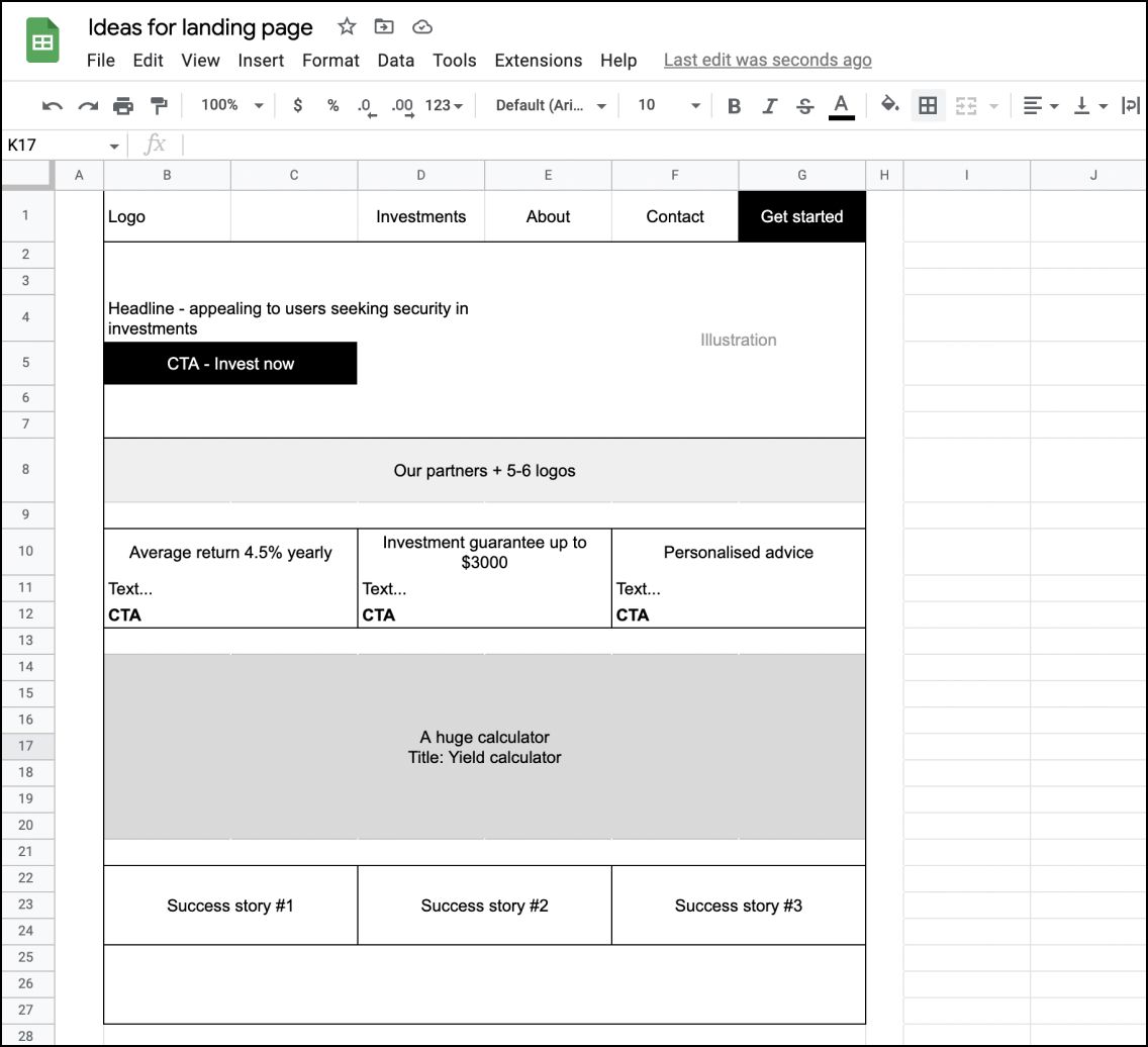
Spreadsheet apps are widespread, meaning every computer or smartphone can run a spreadsheet application. So when we have to get something out of our brain quickly, it's the lowest friction choice. Like this wireframe, I once got from a client as the brief.

Why should anyone bother learning something new and specialized when a spreadsheet just does the job fine?
Takeaway
There's no surprise why Excel won the hearts and brains of so many people. Letting users create their own solutions makes it so engaging that no specialized tool can match. So if you're looking for ways to eliminate it, you must become a better listener and interview users until you uncover and understand their needs. Simply said: you have to provide more value than an excel sheet would. But that won't be easy!